

Jane Gottlieb transforms photographs into colorful worlds shaped by memory, imagination, and a lifelong interest in composition. Born and raised in Southern California, where she continues to live, she brings a distinctly personal sensibility to places encountered during her travels. Her first independent journey to Paris, undertaken in her early twenties, provided images that would remain part of her artistic practice for decades. Returning to these photographs, she has continually reconsidered their possibilities through hand painting and changing photographic technologies. Her work combines photography, painting, and Photoshop. Across an artistic career spanning more than fifty years, Gottlieb has developed an approach in which recognizable settings become spaces for visual reinvention. France holds a special place within this practice, offering architecture, gardens, and reflections that she reshapes through saturated color. Her images invite viewers to experience familiar surroundings through the freedom and pleasure of an artist’s imagination.
For Gottlieb, taking a photograph begins a process that extends beyond the original encounter. A scene recorded during a journey can become the starting point for years of experimentation. Buildings, pools, pathways, and landscapes retain their underlying identities, while their colors change to express another understanding of place. This continuing engagement gives her photographs a life beyond the moment of exposure. Each return offers an opportunity to discover a different relationship between the image, her recollection, and her current artistic interests.
Her connection with France demonstrates this sustained attention. The photographs made during her early visit to Paris became a visual resource she could revisit as her methods developed. Subsequent trips expanded that resource, bringing further subjects into an ongoing conversation between travel and imagination. Rather than presenting France solely through its expected appearance, Gottlieb constructs a version shaped by her own preferences. Intense pinks, blues, yellows, and oranges introduce an exuberance that changes how its architectural and landscape forms are experienced.
The Southern California context of her life provides a useful way to consider this enthusiasm for color. Her images suggest an affinity with brightness, open space, and the visual energy of sunlit surroundings. These qualities enter her interpretations of European settings, creating an encounter between geographic experience and personal expression. France becomes both a destination she has photographed and a place she can continually remake. The resulting images hold together the specificity of their subjects and the freedom of her imaginative decisions.
Hand-painted Cibachrome prints occupy an important place in this practice. Working directly on photographic prints allowed Gottlieb to bring the physical act of painting into contact with the camera’s description of a scene. Color could emphasize a curve, separate architectural features, or transform the atmosphere surrounding a building. The photographic structure remained available as a framework, while painted interventions redirected attention. Through this process, the image became a meeting point between observed detail and the artist’s response to it.
Photoshop subsequently offered another means of pursuing these interests. Digital tools expanded the ways she could reconsider photographs, explore color relationships, and develop variations. Her continued use of earlier images makes this change especially meaningful: a single subject can connect different stages of her practice. New technology supplies further possibilities for ideas she has explored over time. The continuity lies in her attention to composition and her desire to give each photograph an expressive character beyond its recorded appearance.
An exhibition at the UC Santa Barbara Art, Design & Architecture Museum explored her French imagery through this relationship between methods. It brought together hand-painted Cibachromes and versions of the same images transformed using Photoshop. Presenting these treatments together offered viewers a way to follow her changing approaches while recognizing the visual concerns that connect them. The exhibition also highlighted how an artist can remain engaged with an image across decades, finding fresh possibilities within material already familiar to her.
Composition gives Gottlieb’s vivid colors their direction. Architectural lines, repeated shapes, reflections, and changes of scale provide structures through which the eye can move. Color works within these arrangements, drawing attention to particular forms and establishing relationships across the surface. A bright edge can guide the viewer toward a distant building; a contrasting shadow can make a curve more apparent. Her enjoyment of color therefore operates alongside a considered understanding of how an image holds together.
Her artwork has appeared in private and corporate collections, museums, public spaces, galleries, and international art expos, as well as magazines, books, and online articles. Across these settings, Gottlieb offers an invitation to look again. Her practice celebrates the possibility that a photographed place can remain open to interpretation, becoming a source of continued discovery, pleasure, and imaginative renewal.
Pond at Versailles: Architecture Reflected in an Imagined World
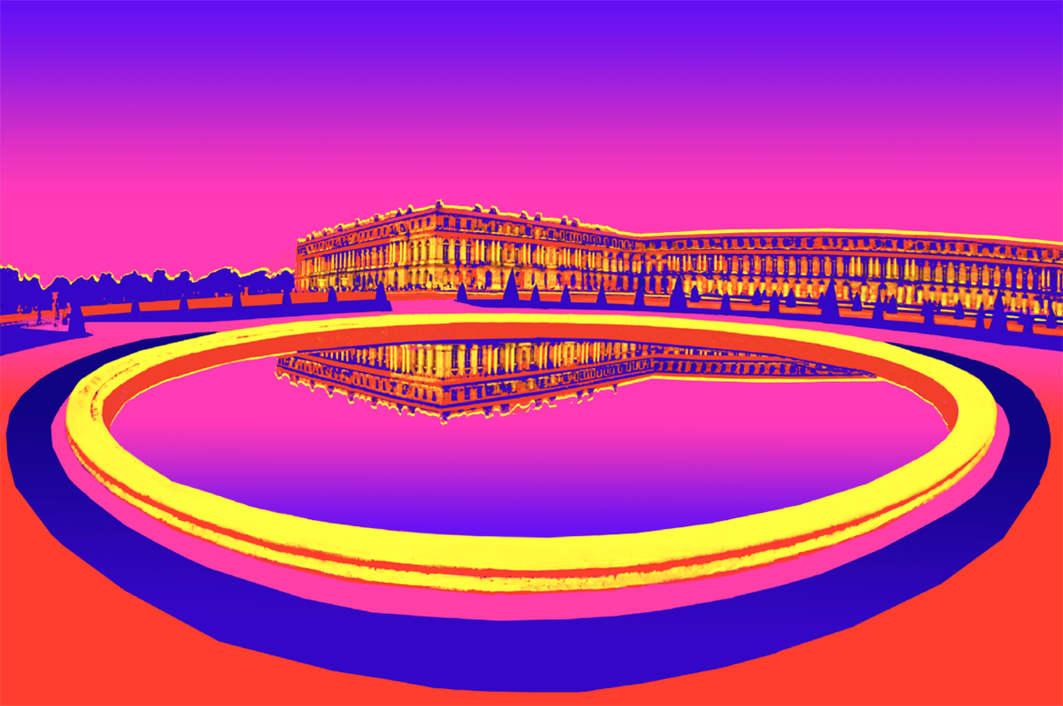
Pond at Versailles, photographed in 1988 and painted in 1989, demonstrates Jane Gottlieb’s ability to transform a recognizable setting through color while preserving its compositional clarity. This archival hand-painted Cibachrome print presents the palace beyond a broad foreground pond, with its architecture reflected in the water. Yellow, orange, red, pink, and deep blue reshape the scene into an intensely colorful arrangement. The setting remains legible, yet its atmosphere becomes imaginative. Versailles supplies the architectural framework; Gottlieb’s painted treatment establishes the emotional and visual character through which viewers encounter it.
The pond dominates the foreground as a large ellipse, its curved perimeter extending across nearly the entire width of the image. This shape establishes an immediate sense of depth while also reading as a bold graphic form. Its bright yellow rim draws the eye around the water, creating a continuous route through the composition. Orange and pink bands reinforce the curve, while a broad blue area outside the rim adds contrast. Together, these surrounding colors give the pond a presence almost independent of its function within the landscape.
Beyond the water, the palace stretches horizontally across the scene. Its repeated windows and architectural divisions establish a measured rhythm that contrasts with the pond’s sweeping curve. Warm yellow and orange passages bring the building forward against the pink sky, while blue accents maintain distinctions within the façade. Gottlieb preserves enough detail for the structure to remain recognizable without allowing that detail to overwhelm the larger arrangement. The palace can be read simultaneously as a building and as an extended pattern of illuminated surfaces.
Reflection provides the connection between these two major elements. An inverted section of the palace appears near the upper portion of the pond, bringing architectural detail into the otherwise expansive water. This repeated image creates a point of concentration within the foreground ellipse. It also encourages the viewer to compare the building with its mirrored counterpart. Above, architecture extends along the horizon; below, it becomes a suspended image surrounded by pink and violet. The relationship introduces visual balance while giving the water an imaginative depth.
The sky contributes another broad field of color. Pink fills much of its lower area, shifting toward violet and blue near the top. This transition is echoed in the pond, where pink similarly gives way to cooler tones. The correspondence between sky and water helps unify the scene, surrounding the warmer architecture with related colors. With little descriptive activity in these areas, attention returns to the palace, its reflection, and the pond’s perimeter. Their relative simplicity gives the detailed building room to remain visually distinct.
Small dark shapes along the terrace punctuate the space between palace and pond. Their repetition helps indicate distance and reinforces the horizontal organization of the middle ground. At the far left, tiny human forms offer an additional suggestion of scale. These details remind the viewer of the photographed setting beneath the painted treatment. They also keep the expansive geometry from becoming entirely abstract, allowing the scene to retain the sense of a place that can be visited and experienced.
The dates distinguish the photographic encounter from its painted interpretation: the image was made in 1988 and reworked in 1989. That interval reflects a practice in which photographs remain available for reconsideration. Here, Gottlieb uses color to renew the experience of looking at Versailles. The pond’s curve, the palace’s repetition, and the mirrored façade become partners in a composition that joins observation with invention, inviting viewers to enjoy a familiar place through a distinctly personal vision.
Select modelGPT-6.1 SolLightNoneMinimalLightMediumHighExtra HighMaxUltraPersistent
To pick up a draggable item, press the space bar. While dragging, use the arrow keys to move the item. Press space again to drop the item in its new position, or press escape to cancel.
